AgentSync Design System |
Introduction:
As the product and team scaled, the existing design system—maintained in Sketch—became difficult to evolve, share, and implement consistently. This project focused on migrating the system to Figma, filling foundational gaps, and establishing a scalable structure that better aligned design and front-end development.
The goal was to create a single source of truth that supported designers and engineers while enabling faster, more consistent product delivery.
Figma File
Problems:
-
The existing design system lived in Sketch, limiting collaboration and scalability
-
Several foundational components were:
-
Inconsistent
-
Missing entirely
-
Implemented ad hoc across the product
-
-
There was no clear hierarchy separating:
-
Core UI building blocks
-
Reusable components
-
Higher-level patterns
-
-
Designers and engineers often rebuilt similar UI elements independently
-
Junior designers lacked clear guidance on how to contribute safely
Goals:
-
Migrate the design system from Sketch to Figma
-
Establish a scalable, well-structured system using Atomic Design principles
-
Ensure parity between design components and production code
-
Reduce duplication and inconsistency across the product
-
Create a system that supports onboarding and collaboration
My Role:
-
Led the design system migration and restructuring
-
Audited and rebuilt existing components in Figma
-
Defined system architecture and component hierarchy
-
Partnered closely with front-end engineers on implementation
-
Mentored and reviewed work from a junior designer contributing to the system
Producer email
Migration: Sketch to Figma
-
Transferred all existing UI components from the legacy Sketch library
-
Rebuilt components using Figma best practices (variants, auto layout, properties)
-
Standardized naming conventions and documentation
-
Ensured visual and functional parity during the transition to avoid regressions
This migration enabled real-time collaboration, faster iteration, and easier system adoption.
Establishing an Atomic Design System
-
To support scalability, the system was restructured using an atomic design approach:
-
Foundations
-
Color
-
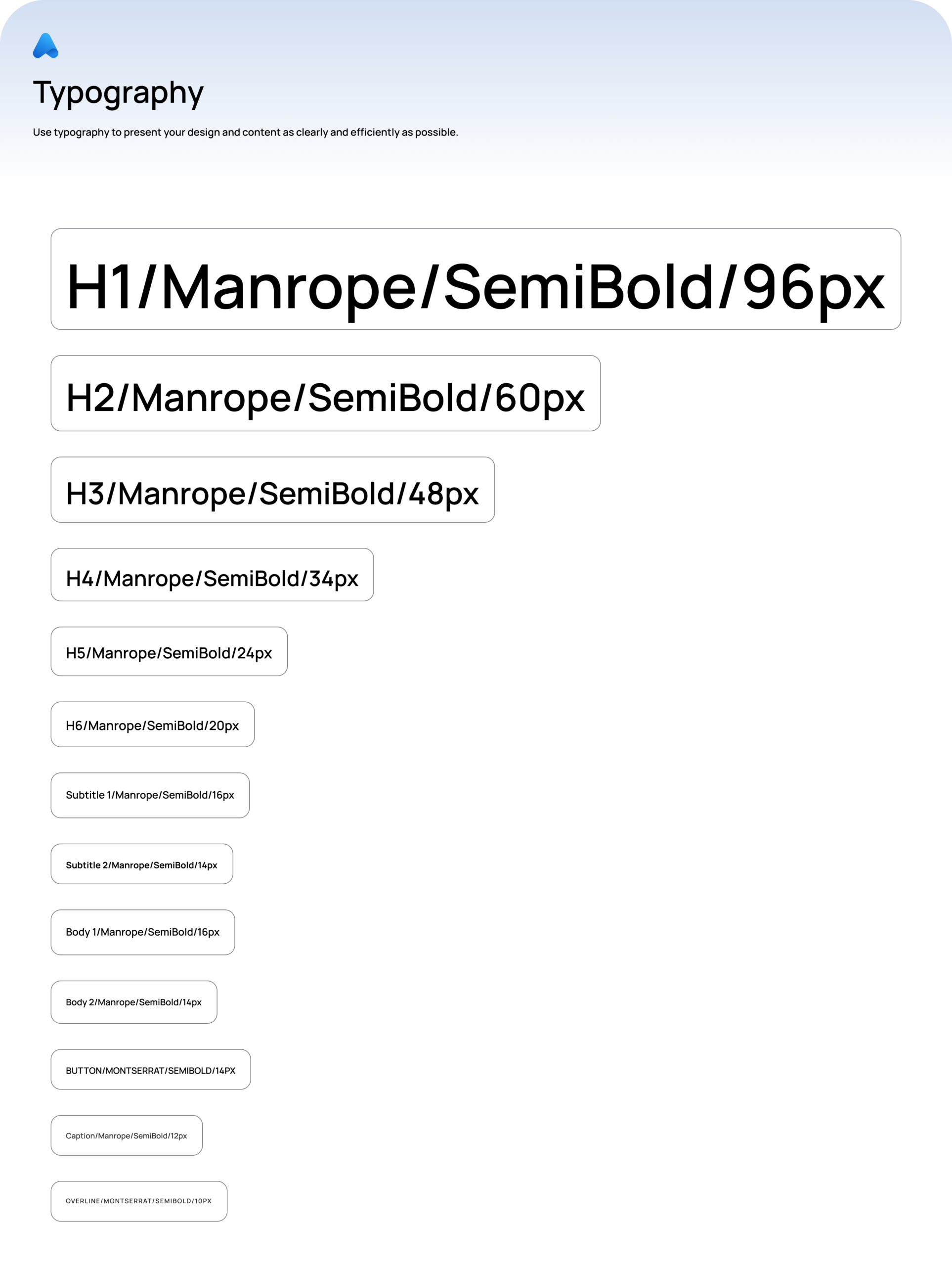
Typography
-
Spacing
-
Grid
-
-
Atoms
-
Buttons
-
Inputs
-
Icons
-
Labels
-
-
Molecules
-
Form fields
-
Input groups
-
Alerts
-
-
Organisms
-
Forms
-
Tables
-
Headers
-
-
Patterns
-
Complete UI solutions composed of multiple organisms and components
-
This hierarchy clarified how components should be built, extended, and reused.
-
Filling the Gaps & Adding Missing Components
-
Identified components that were previously missing or inconsistently implemented
-
Designed new reusable components aligned with product needs
-
Replaced one-off UI solutions with standardized components
-
Ensured new components adhered to accessibility and usability standards
This reduced design debt and improved consistency across the product.
Pattern Library: Beyond Individual Components
To support real-world product use cases, I introduced patterns—pre-built compositions of multiple components, such as:
-
Form layouts
-
Confirmation flows
-
Modals with validation states
-
Page-level UI scaffolding
Patterns allowed teams to move faster while maintaining consistency and correct usage.
Design ↔ Engineering Collaboration
-
Partnered with front-end engineers to:
-
Align Figma components with HTML/CSS/JavaScript implementations
-
Validate feasibility and performance
-
Ensure design tokens and component behavior translated accurately to code
-
-
Iterated on components collaboratively to avoid design–development drift
-
Helped establish shared ownership of the system across disciplines
Mentorship & Collaboration
-
Worked closely with a junior designer contributing to the system
-
Provided guidance on:
-
Component structure
-
Naming conventions
-
Safe extension vs modificatio
-
-
Reviewed contributions to maintain system integrity
-
Helped build confidence and consistency in system usage
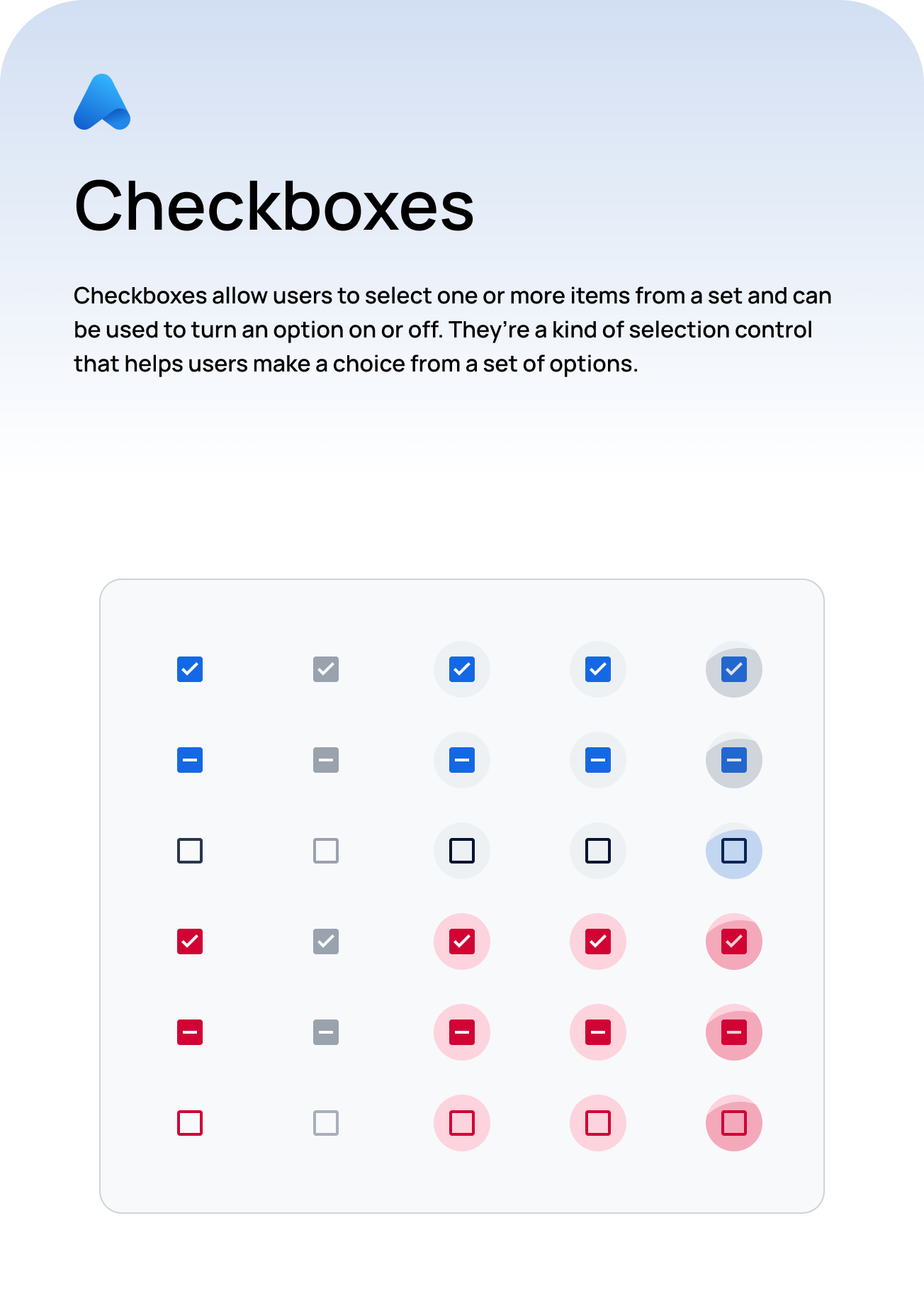
Checkboxes
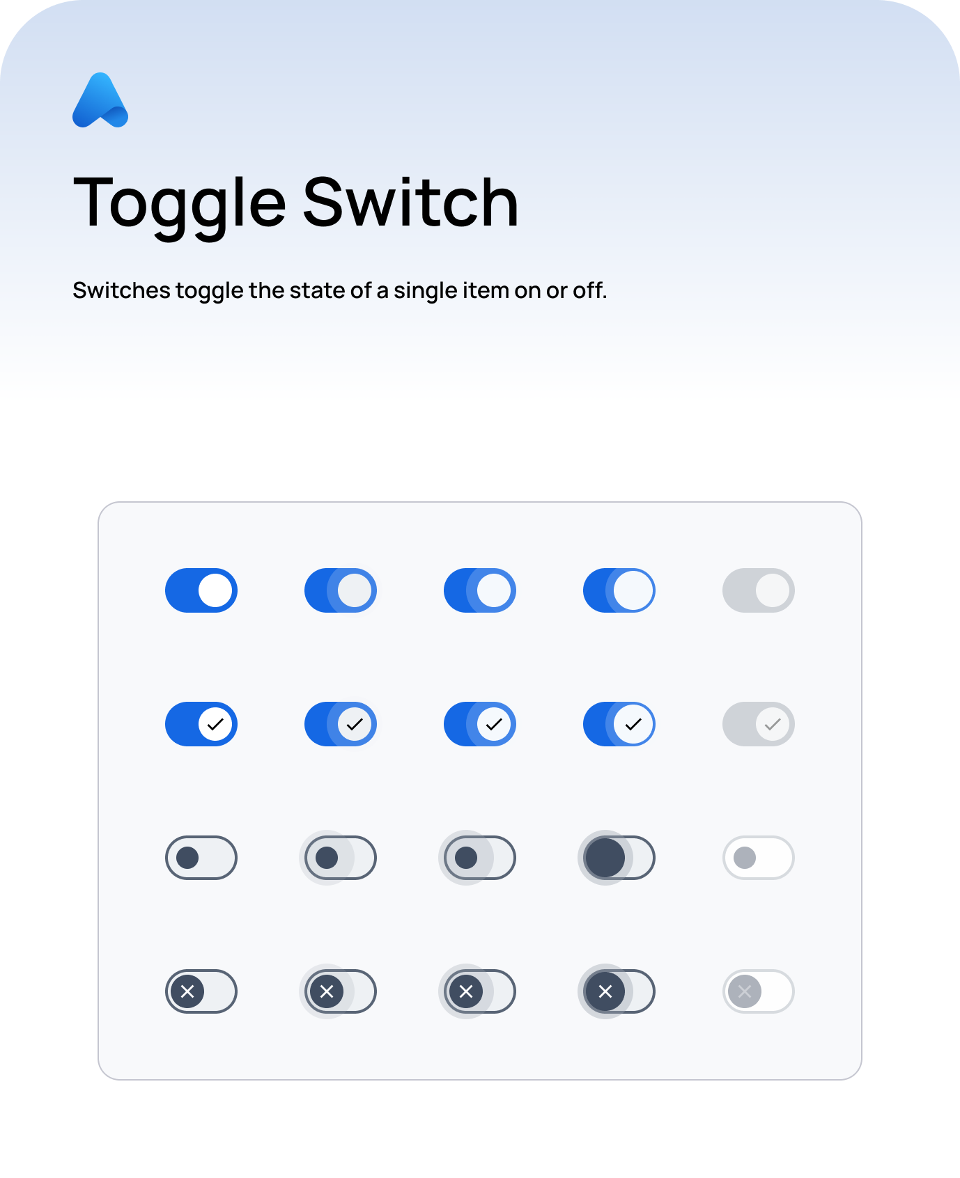
Toggle Switch
Icon Buttons
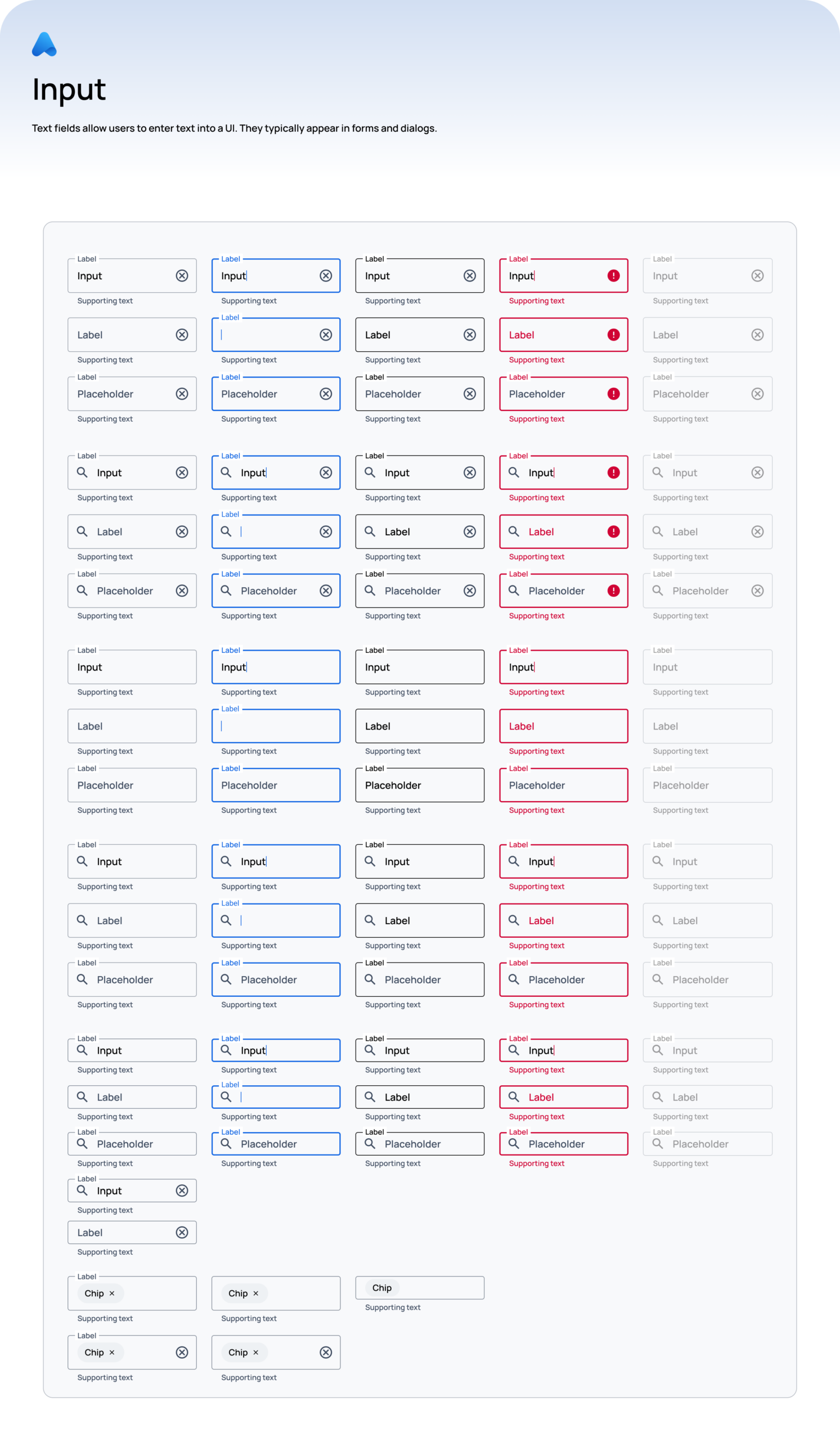
Inputs
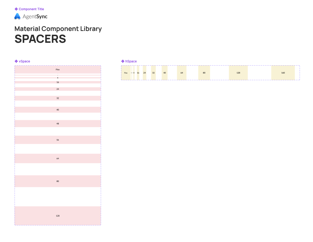
Spacer Component
Outcomes:
-
A modern, scalable design system fully transitioned to Figma
-
Clear component hierarchy that supports growth
-
Improved consistency across product UI
-
Faster design and development workflows
-
Stronger alignment between design and engineering
-
A foundation that supports onboarding new team members
Learnings:
-
Design systems succeed when they are shared across disciplines
-
Clear structure prevents misuse and fragmentation
-
Patterns are as important as individual components
-
Mentorship is critical to long-term system health
What I’d Improve Next:
-
Expand documentation and usage guidelines
-
Formalize design tokens across platforms
-
Introduce automated accessibility checks
-
Track system adoption and usage metrics

